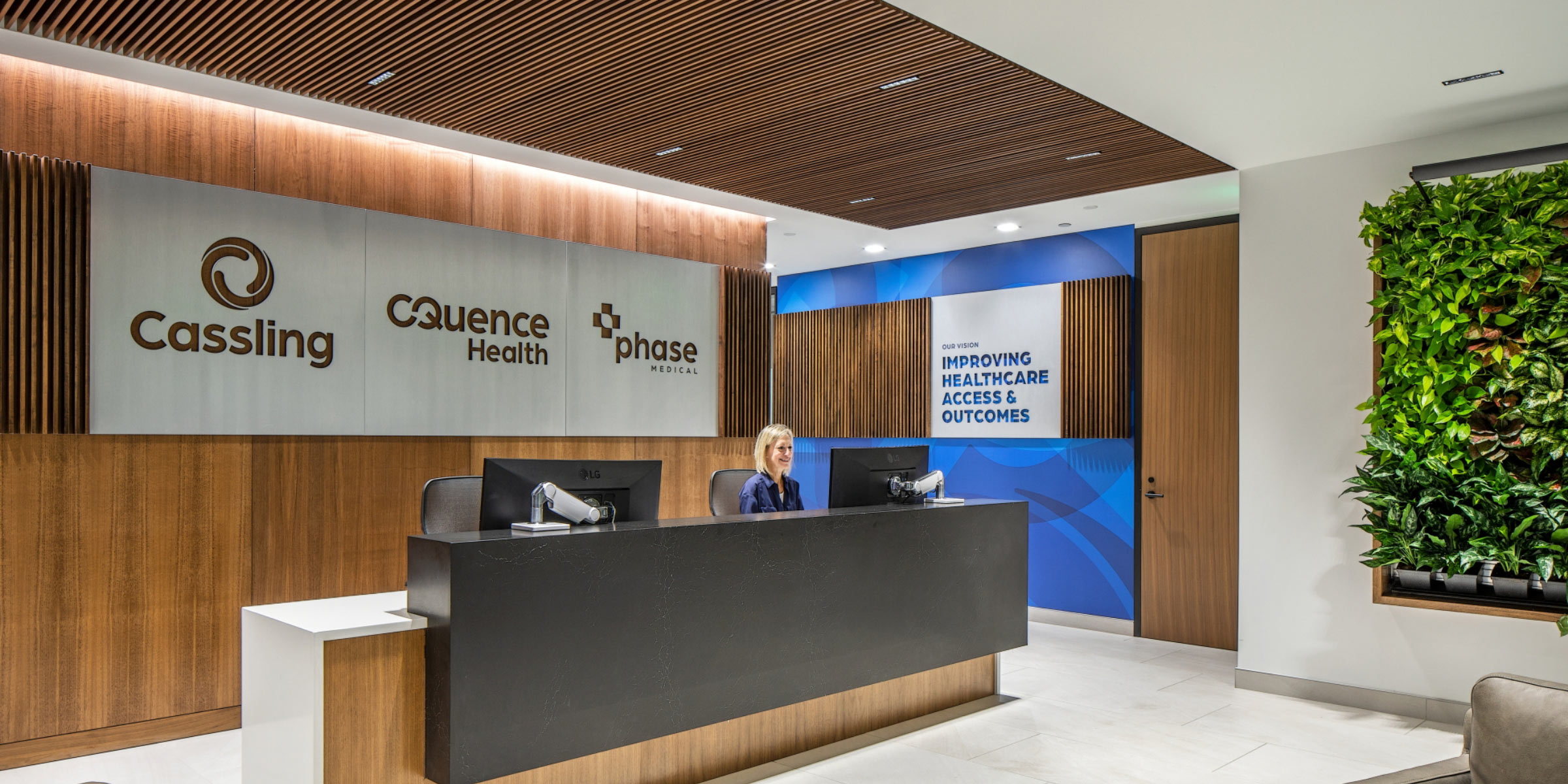
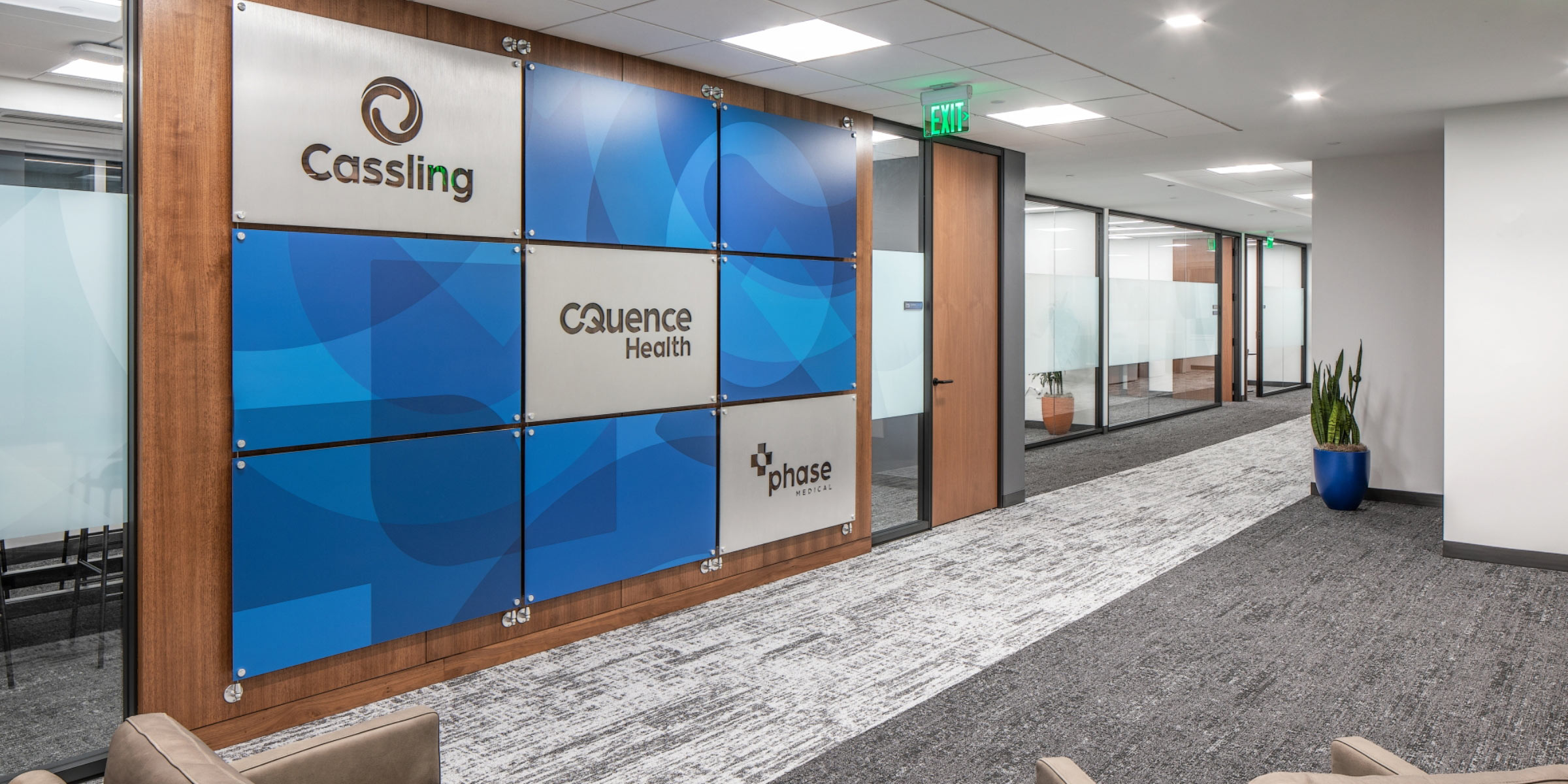
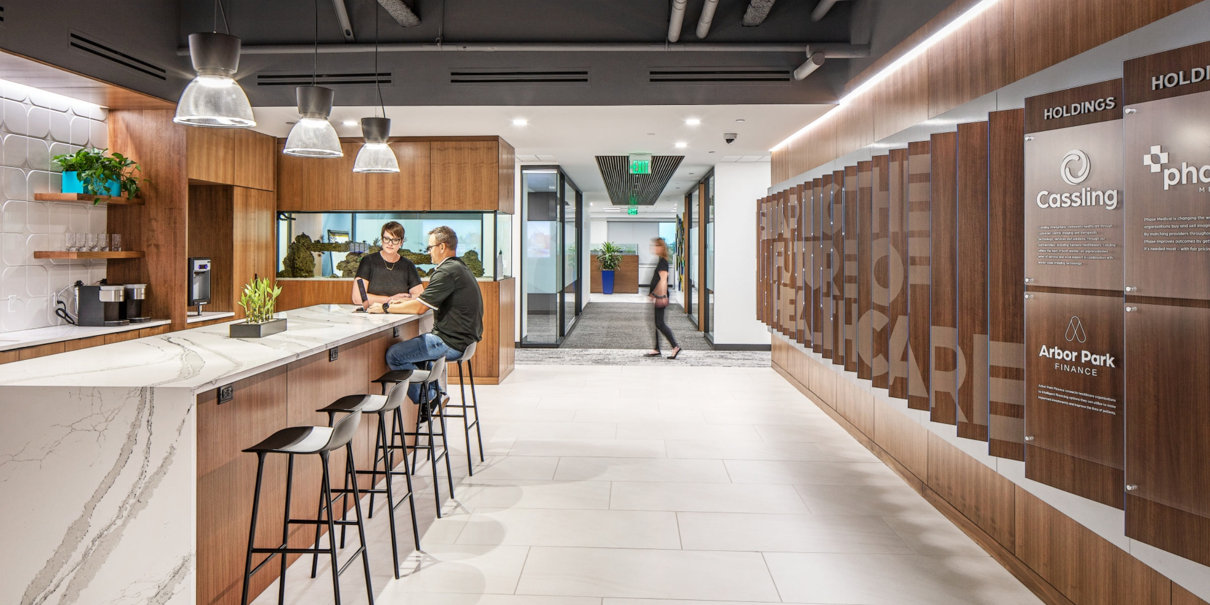
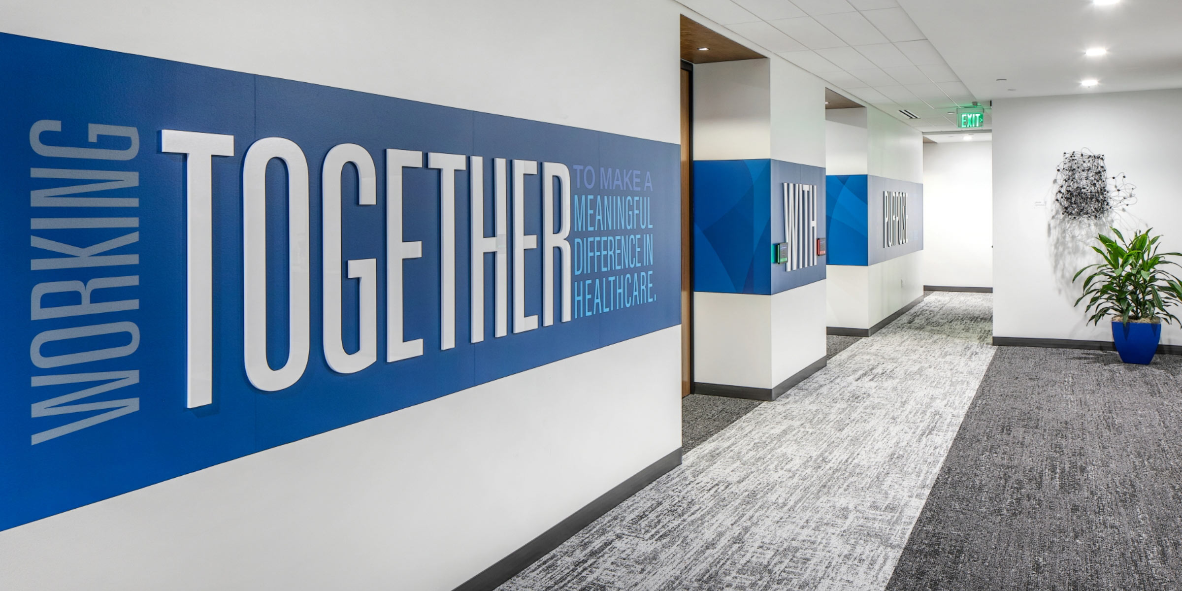
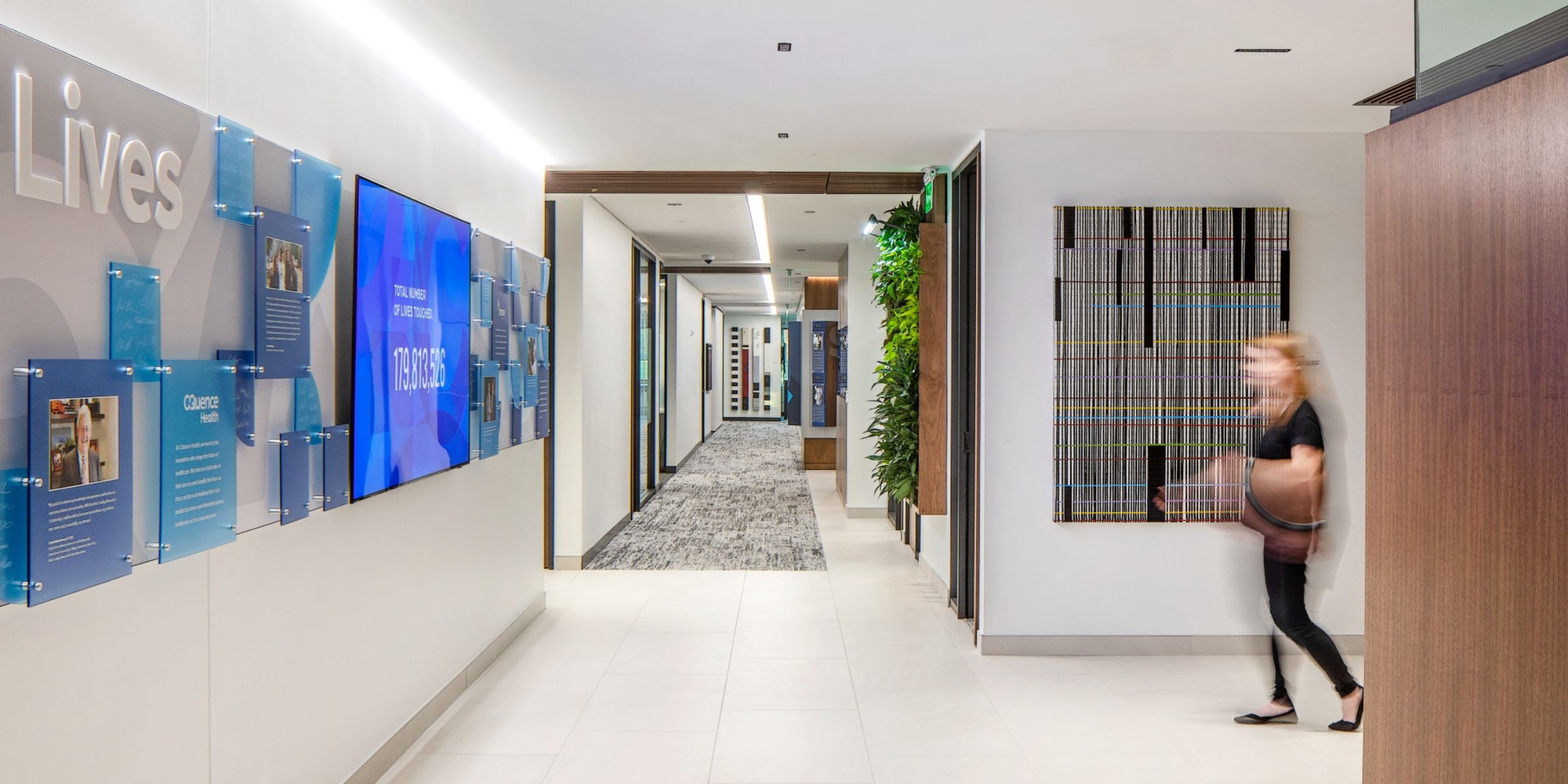
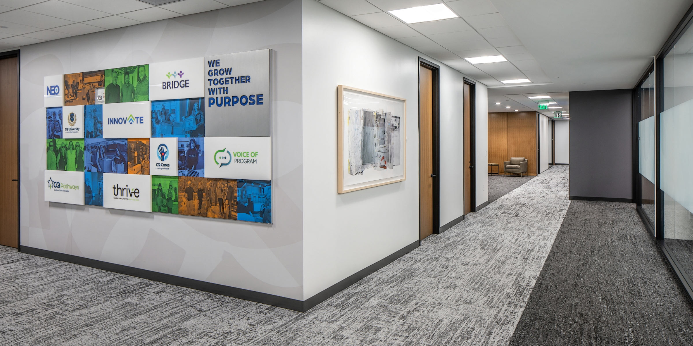
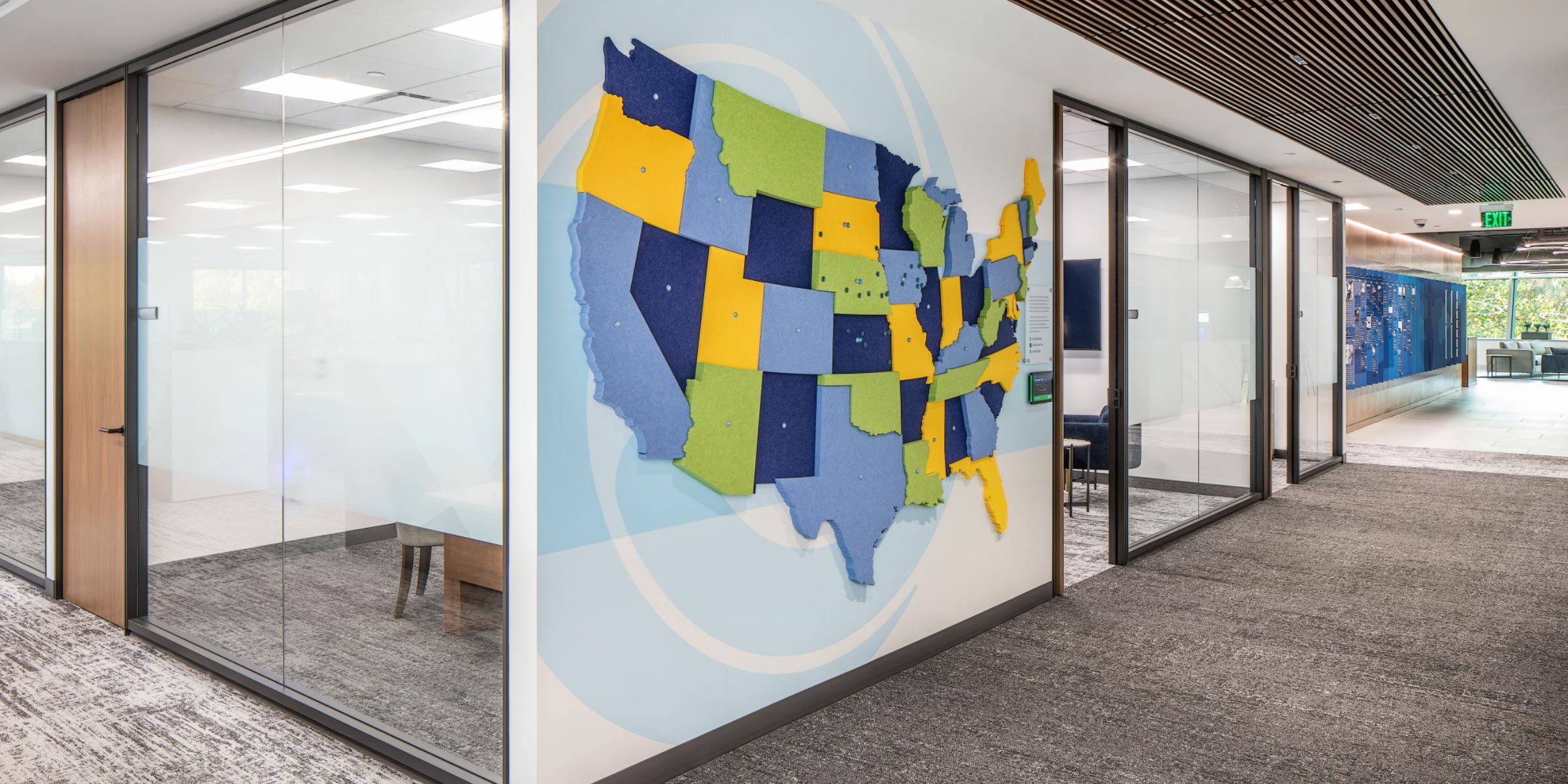
CQuence Health and Cassling are two companies working to improve healthcare access and outcomes nationwide. They partnered with Turnpost to create updated brand identities and environmental graphics for their new headquarters that reflect their role in the industry and their positive impact on patients’ lives. Dynamic environmental graphics create an experience at the headquarters that welcomes and informs visitors and promotes unity and purpose among employees.
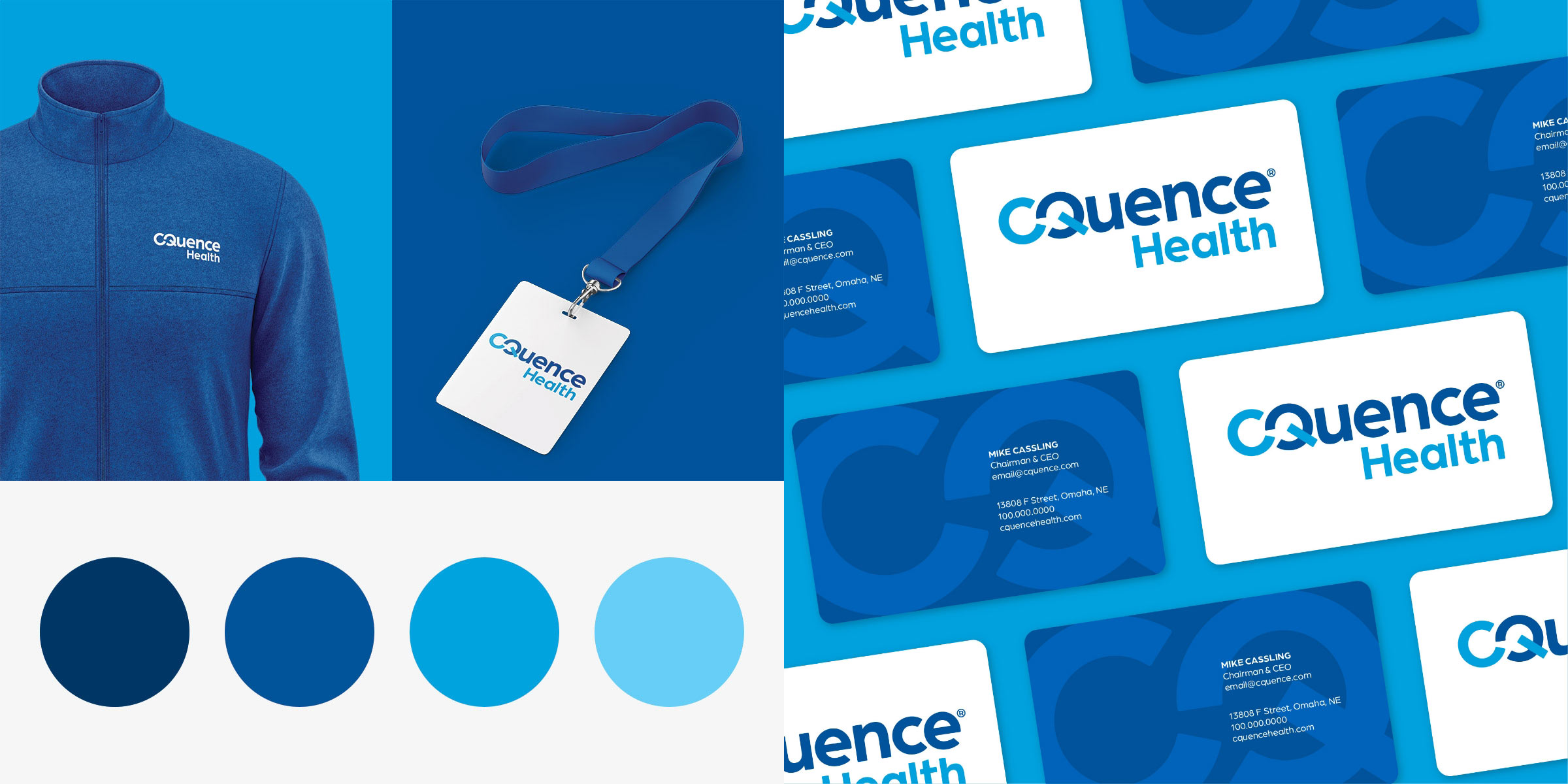
The CQuence Brand
With an updated color palette, a new modern typeface, and a wordmark that combines the C and Q to make an infinity symbol, CQuence Health’s brand now radiates its commitment to serving the healthcare community.
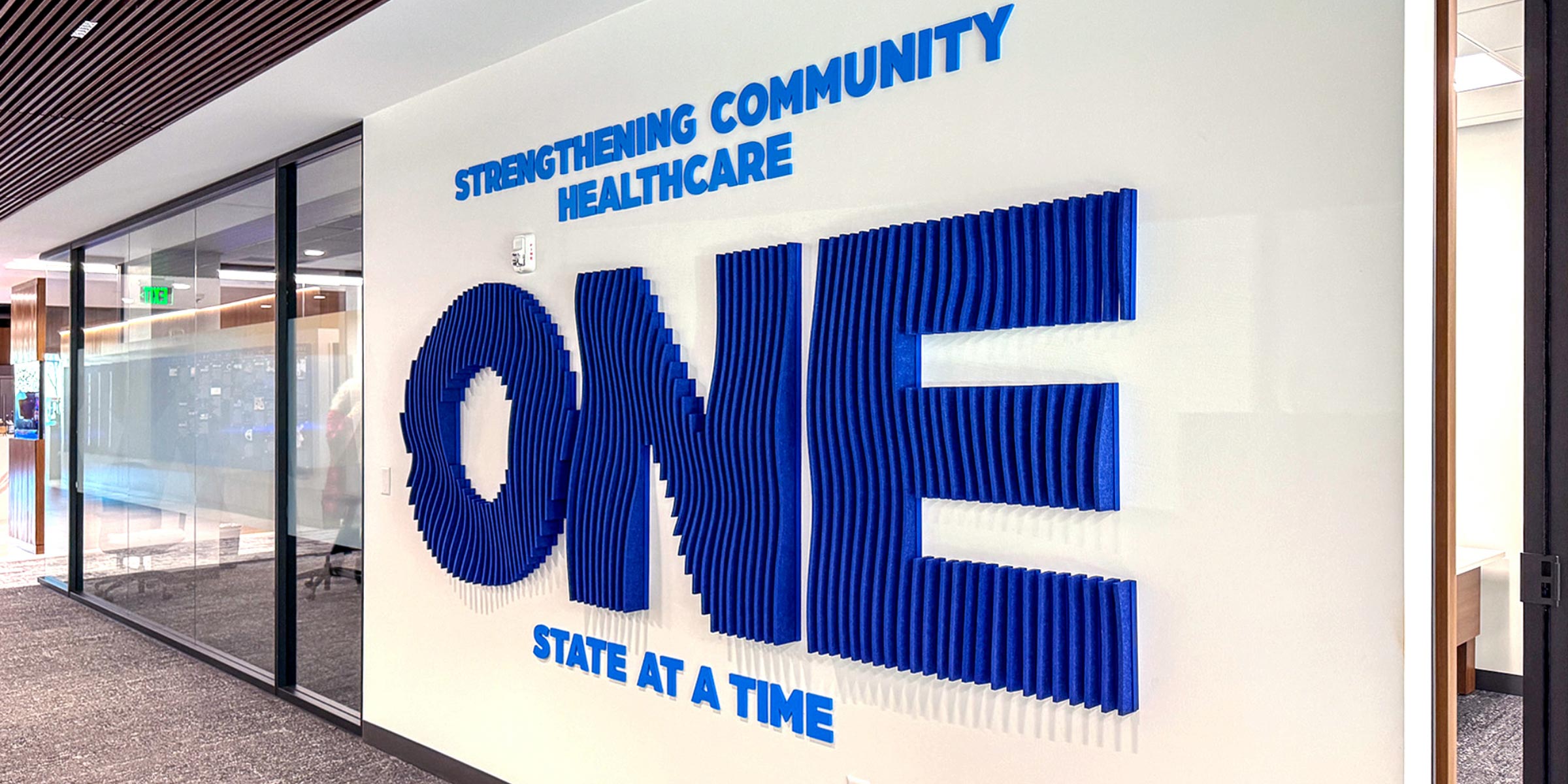
The Cassling Brand
The halo of color in the logo references Cassling’s role in imaging technology and the continuous nature of their work in the evolving healthcare industry. The visual brand conveys Cassling’s relentless passion for strengthening community healthcare.